Newlyweds Isabel and George Blundena “she’s a travel editor, he’s in media” recently overhauled a 1,100-square-foot Victorian railway cottage in southwest London, and moved in with their baby. On Monday, in Rehab Diary, Part 1, Isabel showed us the Before shots and detailed their plans. Yesterday, in Rehab Diary, Part 2, she chronicled the construction process (including discovering midway into the build that they were expecting their first child). Today, we get to see the results of their hard work.
Ground Floor
Finishing the building work was by no means the end of the project. We moved back into the house with chipboard on the floors, a mud pit instead of a garden, no curtains on the front windows, and no blinds in any of the bedrooms. The process that came nexta “the final 10 percent, the finishing off, the decoratinga” was, surprisingly, the hardest slog. This part should have been the most pleasurable but because we had run out of money and time became the most challenging.
We were sensationally naive when it came to lead times for ordering items, and spent weeks living in the house with no kitchen tap and no window coverings. We budgeted hard, but clung to tangible things that would make a difference to the look and feel of the place, such as dimmer switches on the lights, soft-closing mechanisms on the kitchen cabinets, and solid wood flooring.
Photography by Jonathan Gooch for Remodelista.

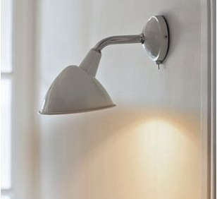
Above: Our new open, light-filled kitchen is a space to share with our family and friends. We were originally going to paint the walls a Farrow & Ball color, but we liked the crispness of the Dulux Primer so much that we left it as is. A pair of wall-mounted Cheyne Wall Lights from Garden Trading are distinctly unkitcheny. The cupboards are from the Burford Family at Howdens Joinery (a trade company, so your builder will have to buy them for you).
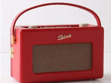
Above: Our countertop radio is a classic Roberts Radio and was a wedding present from great friends. We like it because it has a retro look, but is actually a digital radio with high-quality sound. And we can plug in our iPhone and use the radio as speakers as well.
Above: For our countertop, we chose Bianca Carrara marble from Venice Marble. The amount of veining and shades of gray in each piece varies a great deal, so we hand-selected the slabs ourselves. Our tap, a Phoenician Monobloc Mixer with Porcelain Lever Handles, and countertop were the two luxuries that I was not willing to forgo.
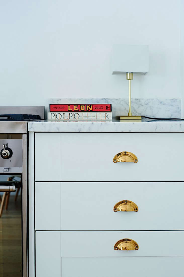
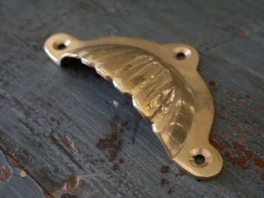
Above: We jazzed up the blank kitchen with flashes of bronze courtesy of £3.50 ($5) cup-pull handles purchased on sale at Graham and Green. We used them sparingly but to great effect.
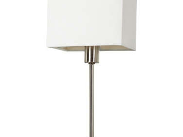
Above: Without any over-counter cupboards, we didn’t install downlights. Instead, we used Ruby Lamps, little table lamps from John Lewis that were the smallest and slimmest ones I could find. We have very little countertop space, and I didn’t want the lamps to encroach any further.

Above: Without a utility room in which to hide the boiler and washer/dryer, we had to steal space from the kitchen. The wide, deep drawers that I had envisioned were simply not going to fit. The boiler was relegated to the garden, and the washer/dryer hidden behind a wall of cabinets. My wished-for Victorian laundry rack got postponed to the next house.

Above: We begged, borrowed, and stole family furniture: shelving that had once been in my husband’s grandfather’s garage; a lamp from my uncle; a chest of drawers that had hidden in a storage room in George’s parents’ house for years, discovered only when they moved; and a curtain from their old sitting room that miraculously fit perfectly across our new back door.

Above: Our birthday presents to each other were plants, soil, and pots, anything for our sparse little patch outside. We bought laurels and clematis and hydrangeas at the end of the season, once they had already flowered and been placed on the sale rail. The bay trees on either side of the lattice were a housewarming present from my mother. We had planned to use the willow trellis to grow something up, but it looks rather nice on its own so we are leaving it as is.
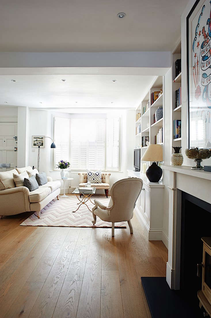
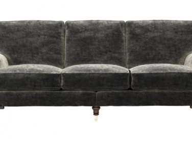
Above: With our budget contraints and decorating challenges, we turned to our families. Part of our vision for our new home was getting inspiration from not only what we had seen in magazines and online but also what we knew. Both of us were keen to incorporate the styles of our childhood homes, and we loved the idea of taking familiar elements from the houses we grew up in. My mother made us cushions using offcuts of her own curtain fabric. The sofa is the Blubell 2 Seater from Sofa.com, upholstered in their herringbone linen.

Above: I chose to study English Literature at Edinburgh University because I am a bit of a bookworm and could think of nothing nicer than spending four years with my nose in novels. I arrange my books by color because I think it looks neater, but it does mean that when I’m looking for something specific, I have to remember whether the spine was green or white or blue or blacka…
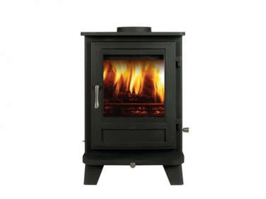
Above: Our one big splash out was the wood-burning stove, a Salisbury 6kw, Multi-Fuel Stove from Chesney’s. We decided to install it during the build, when the house was still a dusty mess and before the plastering and painting were finished. It was one of the largest financial investments, but it is our favorite item in the house and creates a fantastic focal point for that part of the living space. It also warms the whole place to toasty levels on chilly evenings. The Amy Winehouse Silkscreen Print was a present from George that he found at the Soma Gallery in Bristol.
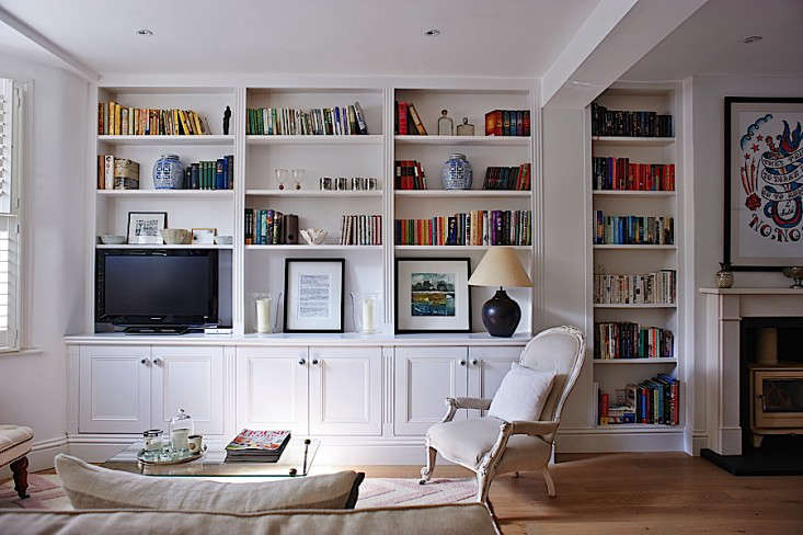
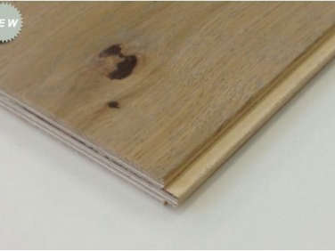
Above: We put built-in storage wherever we could. It helps us control the clutter and makes the space appear uniformly open. Our wood floor is Oak Distressed Old White, an engineered wood from the Natural Wood Floor Company.
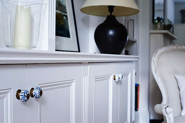
Above:Before we even made an offer on the house, I had said that the doorknobs and other hardware would be the first things to go. We used blue-and-white French porcelain cupboard handles from my mother’s house on the new carpentry in the sitting room.

Above: We moved the downstairs loo to the space underneath the stairs.
Above: One of our various projects was painting an old pine chest from George’s childhood bedroom in Borrowed Light, a very pale blue-gray from Farrow & Ball.
The Second Floor
And when the money ran out, we turned our hands to DIY. We painted old pine furniture that family had handed down to us. A dresser was smartened up with a lick of Farrow & Ball and a glass top. Bedside tables were vastly improved by a few coats of white. Our tatty garden walls brightened up with white paint, and our flowerbeds cheered to be full of plants, herbs, and climbers.
There are, of course, things we might have done differently. The plug socket sunk into the floor for a lamp on a side table in front of the log burner is now just a trip hazard and something that will have to be dealt with before the baby starts playing there. The radiators in the bedrooms have been set too high, so we can’t put off-the-shelf covers on them. They are also, in fact, in the wrong positions. We didn’t get around to redoing the upstairs bathroom; it fell off our order of priorities, but now that everything else has finally been done, it has shot right back up to the top of my to-do list.

Above: We chose carpets for upstairs as a quick fix. I was initially keen on a natural material, such as seagrass or sisal, but was advised that neither is practical with a baby on the way and inevitable spillages. We then considered wood but were worried about the noise. We went to the nearest carpet shop and couldn’t pick one neutral from the next, so I asked the owner what the most popular and reasonable wool carpet was and we went with that. I had reached the point where I couldn’t make any more decisions.
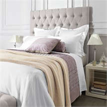
Above: The upholstered headboard in our bedroom is from Feather and Black and is in a woven cotton in a color called Pebble.

Above: The house had absolutely no fitted cupboards when we moved in, so one of the first jobs was to get a carpenter to create as much storage as possible. In the master bedroom, the new Shaker-style cupboards run the entire length and height of the wall.

Above: The bedroom wardrobes, as well as the bookcases and shelving in the sitting room, now have pretty French handles that are from my mother’s house. The plain white porcelain knobs on the doors come from my husband’s childhood home.

Above: Our guest room is simple but luxurious.
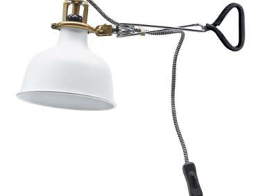
Above: The guest room’s wall-mounted Ranarp Lamps came from Ikea and have drawn more inquiries than items that are 10 times more expensive.
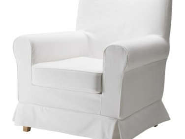
Above: With an Ektorp Jennylund Armchair from Ikea and a Moses basket borrowed from my sister-in-law, the nursery was ready.
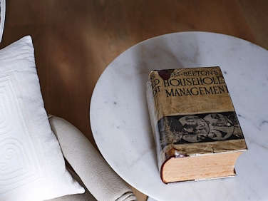
Above: My mother-in-law gave me this vintage copy of Mrs. Beeton’s Book of Household Management. It’s a wonderful book to have in the house, but I haven’t gotten round to making any of the recipes, such as stewed eel, just yet.
Stay tuned: Tomorrow we’ll be posting Isabel and George’s Top 10 Takeaways from their renovation.
For more DIY & Remodeling, take a look at:
- Midcentury Meets Zen: A DIY Remodel in LA
- Expert Advice: 15 Secrets for Saving Money on a Remodel
- The Designers Are In: Expert Tips from Remodeling Pros
Frequently asked questions
What is Rehab Diary Part 3?
Rehab Diary Part 3 is an article on Remodelista that chronicles the transformation of a tiny house in London from a cramped and outdated space into a modern and functional living area.
What was the inspiration behind the design of the tiny house in Rehab Diary Part 3?
The design of the tiny house was inspired by a mix of Japanese minimalism and Scandinavian design, resulting in a clean and simple aesthetic with plenty of natural light and functional storage solutions.
What were some of the biggest challenges faced during the renovation of the tiny house featured in Rehab Diary Part 3?
One of the biggest challenges faced during the renovation was maximizing space in such a small area while still maintaining a sense of openness and flow. Additionally, the team had to work around the existing plumbing and electrical systems, which posed their own set of challenges.
What are some of the standout design elements in the tiny house featured in Rehab Diary Part 3?
Standout design elements in the tiny house include a folding dining table that tucks away when not in use, a custom-built sofa that also functions as a bed, and a minimalist kitchen with a hidden fridge and plenty of storage space.
What is the overall aesthetic of the tiny house featured in Rehab Diary Part 3?
The overall aesthetic of the tiny house is clean and modern, with a focus on simplicity and functionality. Natural materials like wood and concrete are used throughout, and earth tones create a warm and inviting atmosphere.
What is the takeaway from Rehab Diary Part 3 for people looking to renovate a small space?
The takeaway from Rehab Diary Part 3 is that with careful planning and creative design solutions, even the smallest of spaces can be transformed into a functional and beautiful living area. The article also provides inspiration and practical tips for maximizing space and storage in small homes.








Have a Question or Comment About This Post?
Join the conversation